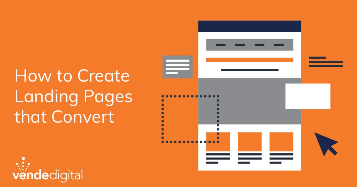
How to Create Landing Pages that Convert
So you have an awesome campaign and are sending tons of relevant traffic to a landing page, but how do you get conversions? You need landing pages that convert.
How to create landing pages that convert
What is a landing page?
Landing pages convert traffic into leads from an online marketing campaign. You can create landing pages to target the top, middle, or bottom of the funnel, but the ultimate goal is to move potential customers through your buyer’s journey into paying customers.
Landing pages are usually not part of your website. They are independent pages that are generated for a specific campaign.
So, what are the steps in creating landing pages that convert?
1. Determine your goal
What are you trying to accomplish? Do you want to collect email addresses, build brand awareness, or promote a product or service?
How will you craft and clarify your message? What problem do you solve, and who is your audience?
What is your specific call to action? Think about what the next closest action you want your audience to take. It can be any of the following but is not limited to the CTAs on this list.
- Download a guide book or E-book
- Register for an event or course
- Subscribe to a newsletter or blog
- Schedule a consultation or meeting
- Sign up for a webinar
When you have a plan and purpose of the landing page, you can set up baseline metrics to start measuring the conversion. Are you looking to add connections, create MQL’s, SQL’s, or just make your business more visible? When you have a clear goal or plan, you can then create the CTA.
2. Keep the message simple
Since landing pages are created for a specific purpose, campaign, or goal, you want to keep your copy and message light and simple. Landing pages are meant to be a quick stop, so make sure they load fast and are mobile-friendly.
Create a killer headline! This is what your audience will see first, along with the subheading, pictures, and CTA.
When you start to speak in industry terms or jargon, you might lose your audience. Write the way you speak and add humor and personalization to your landing pages.
Keep your sentences short and simple, and avoid cliche marketing terms like “world-class” or “best of the best.” Come up with something catchy and original.
3. Use Testimonials
Customer testimonials add a lot of value to your landing page and help connect you to your audience. There is nothing wrong with showcasing what others think about you or your business.
Curate a collection of reviews and testimonials and pick the best 2-3 to highlight. Be specific and use numbers to highlight how you have changed your current client’s situation.
4. Video Video Video
Videos are the easiest content to consume and can increase your conversion rate by 80%.
When you consider adding video to your landing page, make sure:
- They are short and sweet - less than 3 minutes in length
- Produce professional-quality videos to capture attention
- They describe your offering
- Use a thumbnail
- Post them above the fold
Videos are stimulating and get your message across in a quick, easy way as well as humanize your brand.
5. A/B Testing and Tweaking Landing Pages that Convert
To have an understanding of what copy converts, you have to test and tweak continually. Chances are you won’t hit it out of the park the first time.
When putting A/B testing to work, you can have a winner and loser and metrics to measure by such as google analytics. You can see what copy converts a higher percentage of traffic and how long your audience stayed on that page. This allows you to shift your efforts and make minor adjustments without redoing the entire page.
These are some of the items you can A/B test:
- CTA (call to action)
- Headlines, subheadings or product descriptions
- Information collected on forms
- Landing page layout and style
- Pricing and Promotions
- Images and Videos
- Short or long text on the page
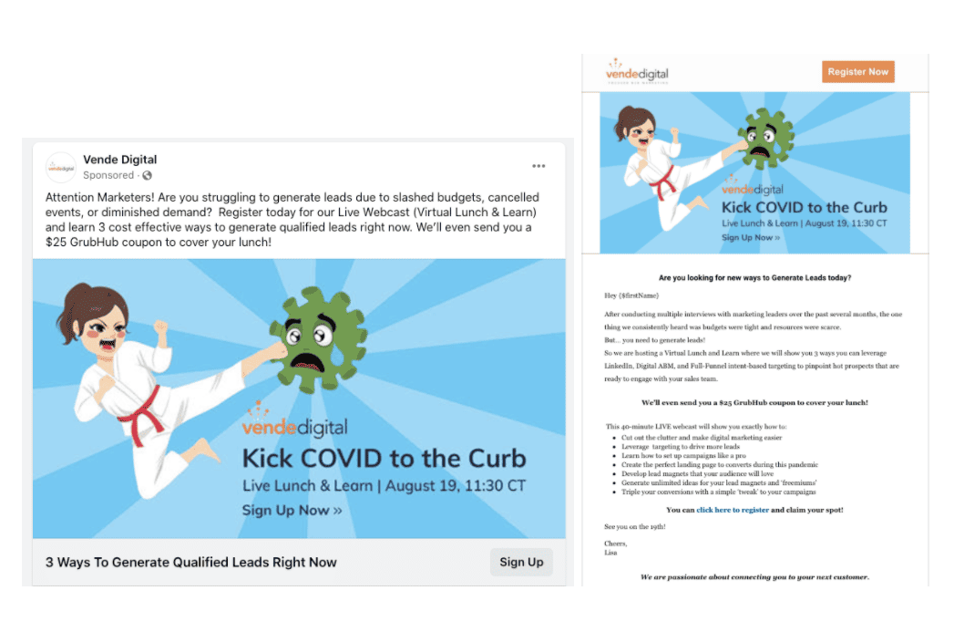
To summarize, the overall look and feel of the landing page should align with the campaign you are currently running.
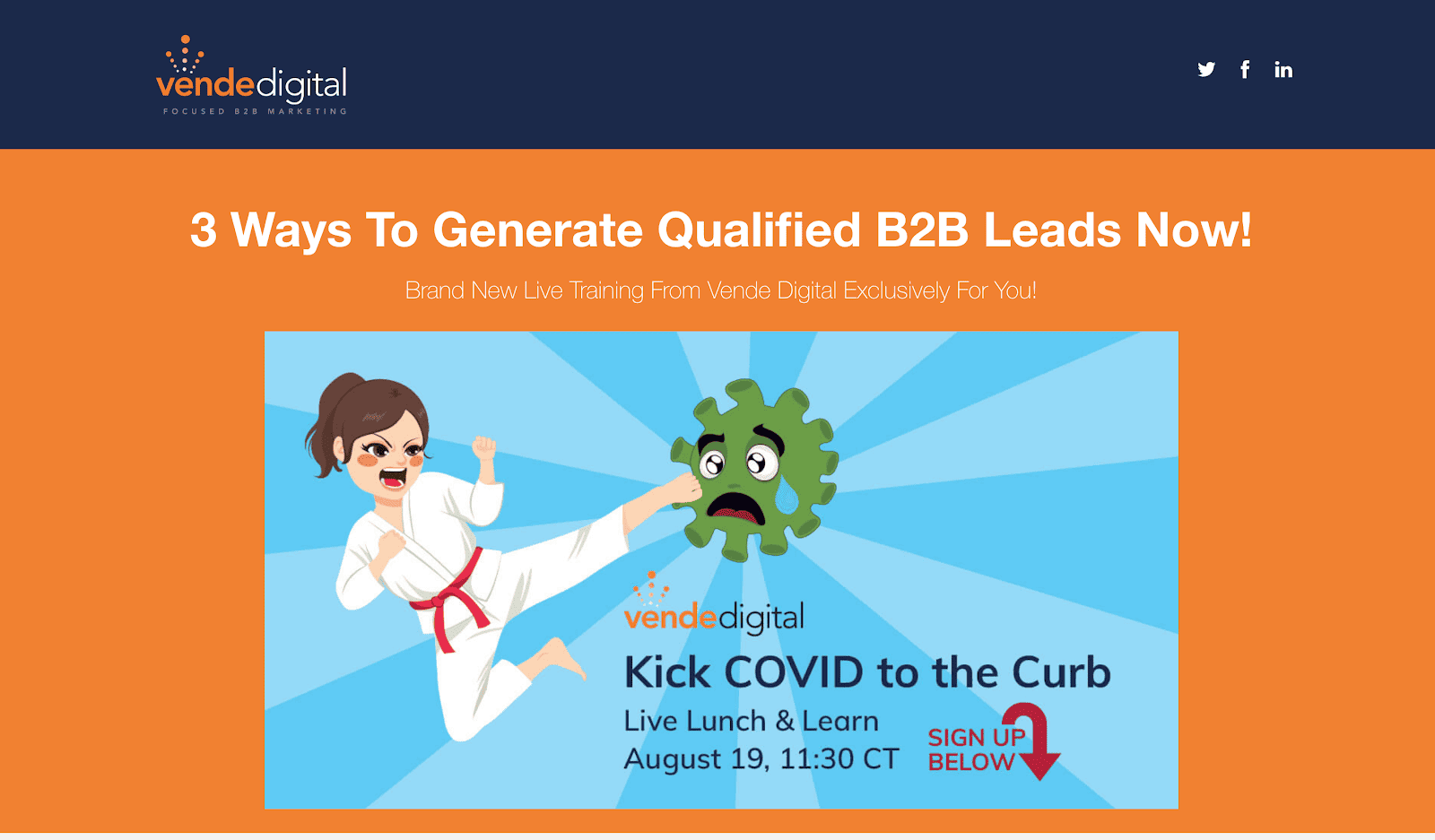
With our “Kick COVID to the Curb” campaign, our messaging and landing page all had the same look and feel. This allows your audience to connect the dots and smoothly transition from the ad to the page.
Key Takeaways for Landing Pages that Convert:
- Setting up your goals, plans, and purpose
- Keep your message short and simple
- Have a clear call to action
- Incorporate video when possible
- Testimonials add value and social proof.
- Constantly tweak and make minor changes to see what works and what doesn’t
Do you need help creating a Landing Page or Launching a Campaign for your business?
We offer marketing automation, training, and support for companies wanting to take their digital marketing to the next level. If you are interested in learning more, sign up for a complimentary planning session. Schedule yours today, and let’s see if we can help.
.png)
