As kids, we were often told to not judge a book by its cover. But that same rule doesn’t apply to websites. In fact, up to 90 percent of a consumer’s initial judgment of a product is based on color. That means that applying color psychology, and knowing how the psychology of colors boosts website conversion, can increase your businesses conversion rates.
Looks Matter
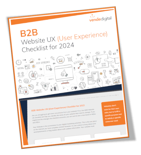
The number one influencing factor affecting purchase decisions for online shoppers is website appearance. Poor website navigability and poor overall design will affect purchase decisions, as well. Over 40 percent of shoppers base their opinion of a website on overall design, and over 50 percent of shoppers won’t return because of overall aesthetics. Get a copy of our UX checklist here (ungated).
Product assessment takes just 90 seconds and the vast majority of this judgment is based on color alone. For over 80 percent of consumers, color is the main reason they buy a particular product. But it isn’t just the color of the product that is important. Color impression is responsible for 80 percent of brand recognition as well.
The Psychology of Colors
Different colors, or hues, have different emotions that people associate with them. Brighter colors often portray characteristics such as energy or excitement, while white and silver colors signify perfection. That means that depending on what industry you are in you will want to use different colors on your website. Colors that are great for healthcare aren’t necessarily the same colors that are great for food brands. And not only do different colors portray different characteristics, certain colors attract different types of buyers.
Know Your Buyer
Budget shoppers are attracted to different colors than traditional clothing buyers. Men are attracted to different colors than women. Knowing who your buyer is will determine which colors will work best for you. Impulsive buyers are most commonly found in clearance sales, outlet malls, and fast food establishments. They are most attracted to royal blue, black, and red-orange. Is your buyer on a budget? Budget shoppers can be found in banks and larger department stores. These buyers are attracted to navy-blue and teal above all other colors. If your buyer is a traditional buyer they are most likely to be found in clothing stores and are attracted to pink, rose, and sky-blue. As a whole, women prefer soft colors and are more receptive to tints, while men prefer bold colors and are more likely to select shades of colors.
Red
Red signifies life, excitement, and boldness. The color red increases the heart rate and creates urgency, which is why it is used in clearance sales. As the most emotional color, red is popular for food, technology, transport, and agriculture brands. Brands that use red include Coca-Cola, Kellogg’s, Lay’s, McDonald’s, Red Bull, Virgin, Nike, Ace Hardware, KFC, Avis, Colgate, TIME, and Nintendo.
Blue
Blue is the single most commonly used color in today’s websites and branding. It is best seen by everyone, making it one of the more popular colors. Blue signifies productivity, tranquility, and trust, which is one of the reasons banks and businesses choose it to communicate security to clients. Blue is favored by 57 percent of men and 35 percent of women and is popular for healthcare, energy, finance, airlines, agriculture, and technology. Brands that use blue include Skype, LinkedIn, Twitter, Facebook, IBM, Ford, Oral-B, GE, PayPal, Pepsi, and Visa.
Green
Green is associated with growth, nature, and harmony, which is why it is used in many stores to help customers relax. Green is a popular color for energy, finance, food, household, and technology businesses. Brands that use green include The Body Shop, Subway, Spotify, Whole Foods, Animal Planet, and Holiday Inn.
Orange
Used to signify a call to action — sell, buy, or subscribe, orange signifies ambition, enthusiasm, and confidence. Orange is a popular color for healthcare and technology companies. If you’re looking to use orange on your website you might want to note that the web color orange, defined as #FFA500, is the only named color defined in CSS that is not also defined in HTML 4.01. Brands that use orange include Nickelodeon, Hooters, Harley-Davidson, and Fanta.
Black
Black is the most popular choice for marketing luxury products, which makes it popular for technology, clothing, and car businesses. Black signifies authority, power, and elegance to buyers. Brands that use black include Louis Vuitton, Jaguar, Mont Blanc, Chanel, and BlackBerry.
White/Silver
In advertising, white is associated with coolness and cleanliness, and it also often signifies perfection. White and silver are popular color choices for healthcare, clothing, credit cards, and charity. Brands that use white include Apple, Ralph Lauren, ASOS, and Honda.
Purple
Most often found in anti-aging or beauty product chromatics, purple signifies wealth, power, and royalty. Purple is a popular color for healthcare, technology, and finance. Brands that use purple include Yahoo, Craigslist, Taco Bell, Cadbury, and Crown Royal.
Yellow
Often associated with food and used by brands to evoke cheerful feelings, yellow signifies joy, intellect, and energy. Yellow is popular for household, energy, and food companies. Brands that use yellow include National Geographic, CAT, Shell, Pennzoil, DHL, and Hertz.
What Color is Right For You?
As a marketing experiment, HEINZ changed the color of their signature ketchup bottle from red to green. Over the following 7 months, HEINZ sold over 10 million bottles, which led to $23 million in sales and the highest sales increase in the brand’s history. Red, orange, and green are typically the best colors for call-to-action buttons and conversions, but only if they stand out.
BMI’s red color on their CTA button increased conversions by 2.5 percent. HubSpot and Performable both saw increases in conversion when they used red buttons rather than green buttons. Beamax increased their link clicks by 53 percent by changing the color to red instead of the original blue. Dmix increased conversions by 34 percent after they changed their CTA to red.
Ript got a 6.3 percent increase in sales by changing their green to yellow. VegasSlotsOnline.com also changed their CTA ‘Sign Up Here’ button from green to yellow and increased conversions by 175 percent. Extra Storage Space got 7.8 percent increase in online reservations after changing the CTA button from blue to orange.
It takes patience and testing to find the right colors for your website. But knowing who your buyer is, and how the psychology of colors boosts website conversion, will help you determine what colors you should be using. When the number one influencing factor affecting purchase decisions for online shoppers is website appearance, make sure you are putting your best foot forward. Need help picking the right colors for your brand? Sign up for a free website analysis


